Creating a Dashboard with Custom Plots
Learning Objectives
The learning objectives of this article is to learn how to:
- Create a custom plot dashboard
- Where to find dashboards in the UI
- Basic API usage to register plots
Introduction
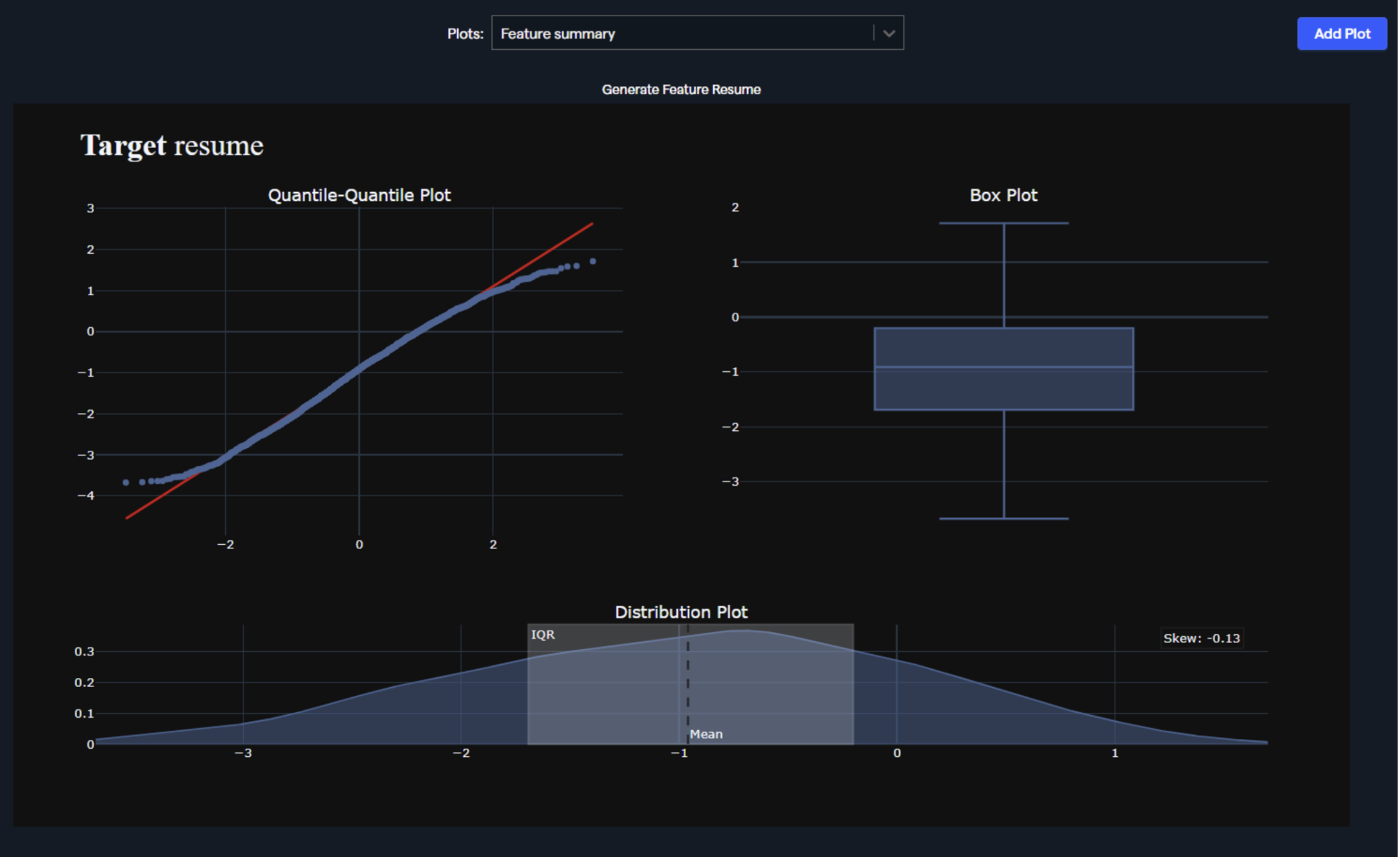
Abacus allows you to generate and register plots within our UI. Using this method, you can create a custom dashboard that looks like below:
Navigating the UI
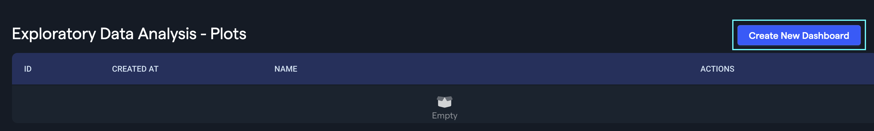
- Create a project
- Navigate to the EDA > Plots tab within the project
- Click Create New Dashboard button
Note: "EDA" option exists only in Structured ML project types. You can always create a Structured ML project type and use "Attach Feature Group" to bring data from other projects and create your dashboard.
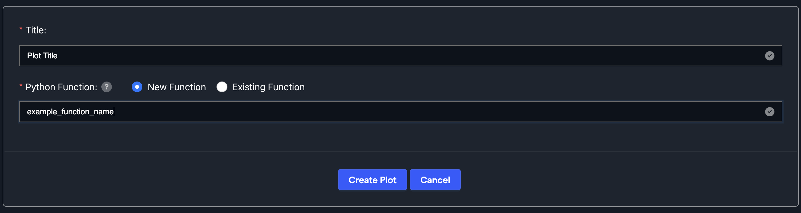
- Provide the dashboard name. Click Add Plot button after creation:

- Provide the plot's title and function name. Once you click the Create Plot button, you'll be redirected to the embedded notebook to create the plotting function and register it within the dashboard. More details are provided in the API approach.
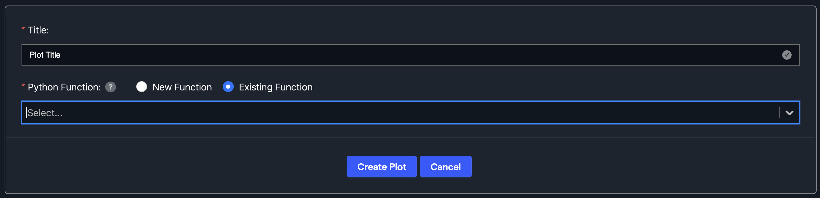
- Alternatively, you can select a function created earlier. In that case, you have to provide required arguments to the predefined function.
Please note that not all projects allow for a dashboard to be created. “Predictive Modeling” is the essential project type that supports dashboard creation.
Basic API’s required
Create a project:
from abacusai import ApiClient, ApiException
client = ApiClient()
project_name = 'sales_over_time_test_ak'
project = client.create_project(name=project_name, use_case='PREDICTING')
Create a dashboard:
graph_dashboard = client.create_graph_dashboard(project_id=project.id, name=project_name)
Define a plot function. The example function below takes as an input feature group, aggregates sales by the day of week and promo indicator. The column names can be used as the function arguments as well.
function_name = 'sales_over_time'
def sales_over_time(df):
    import plotly.express as px
    # bring data into appropriate format
    df = df.groupby(['DayOfWeek', 'Promo']).agg({'Sales': sum}).reset_index()
    df = df.sort_values(by = ['DayOfWeek', 'Promo'])
    # make a plotly animation plot
    fig = px.scatter(df, x="DayOfWeek", y="Sales", color = "Promo")
    # adjust labels
    fig.update_layout(title='Sales variability by Day of Week & Promo')
    fig.update_xaxes(title_text='DayOfWeek',title_standoff=0)
    return fig
For creating a python function, we need to specify the function variable mappings. They can have literal types and values. FEATURE_GROUP is one of the types and its value points to a table name in the example below.
function_variable_mappings = [{'name': 'df', 'value': 'store_sales_data_test', 'variable_type': 'FEATURE_GROUP', 'is_required': True}]
Register and add the plot to the dashboard
try:
    python_function = client.create_python_function(
        name=function_name,
        function_name=function_name,
        source_code=sales_over_time,
        function_variable_mappings=function_variable_mappings,
        function_type='plotly_fig')
except ApiException as error:
    if error.exception == 'AlreadyExistsError':
        python_function = client.describe_python_function(name=function_name)
    else:
        raise error

client.add_graph_to_dashboard(python_function_id=python_function.python_function_id, graph_dashboard_id=graph_dashboard.id, function_variable_mappings=function_variable_mappings, name=function_name)